Page 1: Analyzing Global Health Data
Unit 5, Lab 3, Page 1
Tim points out that we are missing an “In this lab” on this first page of the lab. –MF, 5/23/20
On this page, you will learn how data visualization can help people understand data.
Large data sets can be overwhelming to analyze, but software tools can help people extract information, identify trends, make connections, and solve problems with data. Software programs, such as the graph below from Google can allow you to process data interactively to gain insight and knowledge.
-
If the interactive graph doesn’t work on this page, you can view it on google.com.
Explore the following interactive data set.
- What does each point represent?
-
What does each axis represent? Reveal a hint about the axes.
If you are viewing the data on this page, the label for the vertical axis is at the top of that axis. (If you are viewing it directly on google.com, it’s along the left where it usually is.)
- What do the colors represent?
- What does the size of each point indicate?
- What does the slider at the bottom do?
-
 Analyze the data. In the interactive graph above, click the play button in the lower-left or move the slider at the bottom. Discuss the following:
- What does this interactive data set tell you about global trends in life expectancy over time (on average)?
- What about global trends in fertility over time (on average)?
-
DAT-2.E, DAT-2.E.3 clustering only
Looking at clusters in the data can help you gain insight and knowledge. Do some research online to help you answer the following:
It’s not clear to me that “doing some research” is needed to answer these questions. Did we say that because of the standards? If so, maybe the questions below could ask more pointed questions that can’t be answered just from exploring the interactive data. If not, maybe the phrasing above should be adjusted. –MF, 5/31/20
- Move the slider around between 1940 and 1950, and describe trends you see among certain countries. What is going on during this time?
- Move the slider to 2023 (all the way to the right), and describe the meaning of the cluster of pink data points in the upper left. What does this tell you about trends in about this region of the world at that time?
- Move the slider back and forth across time, and select one country that follows a path that is interesting to you. Describe what this tells you about the life expectancy and fertility of this country over this time period.
![]()
In ordinary speech, the words “data” and “information” are used interchangeably. But in computing, these words have specific technical meanings.
: Data vs. Information
DAT-2.A.1
- Data are the values that computers receive from various sources, including human activity, sensors, etc.
- Information is the humanly-useful patterns extracted from data.
DAT-2.A.2
Data provide opportunities for identifying trends, making connections, and addressing problems. Information is the result of analyzing that data.
The data given in the graph above let us answer some questions but not others. We can, for example, answer questions about how patterns of fertility and life expectancy differ from one continent to another, but not questions about how life expectancy is affected by the jobs people do, because the data displayed doesn’t show jobs.
-
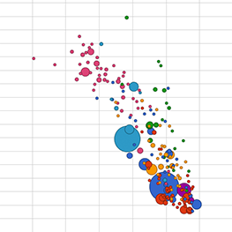
In any given year, the graph has a downward slope. That is, countries with a higher fertility rate have a lower life expectancy. This kind of relationship is called a correlation. What (if anything) does that tell you about the relationship between fertility rates and life expectancy? This pattern in the data becomes obvious looking at the picture, but it would not have been obvious just looking at the data.
- Make up a scenario in which high fertility rates cause low life expectancy. Then make up a scenario in which low life expectancy causes high fertility rates.
-
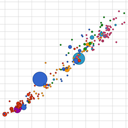
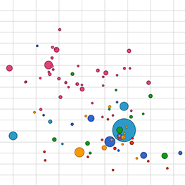
A correlation is a particular kind of information, namely a dependence between two variables. For example in the first picture here, as one variable goes up the other goes down. It’s also a correlation when as one variable goes up or down the other changes in the same manner.


negative correlation
positive correlation
no correlation
DAT-2.E.4
Insight is a meaningful conclusion drawn from analyzing information.
DAT-2.A.3, DAT-2.A.4
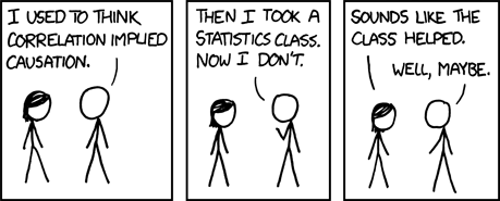
The data by themselves don’t tell you what causes what. There may be a correlation between two things, but this does not mean one thing causes the other. People often say, “Correlation does not imply causation.” Additional research is needed to gain insight into the exact nature of the relationship, such as causation.
An example of two things that are obviously correlated, but obviously neither caused the other. You can click “View Random” on that site to find other strange correlations.
DAT-2.E.3, DAT-2.E.1
Often, a single source does not contain the data needed to draw a conclusion; it may be necessary to combine data from a variety of sources. As you found using visualization software with the fertility and life expectancy data, sometimes a pattern you discover in one data set can just raise another question for research such as, “Are either of these things correlated with median income in the country?” To answer this question, you could find an economic database, download some data, and use look for additional correlations. There can be several cycles of seeing something in the data and collecting more data to examine before you have what seems like a reliable insight about causation.
-
 Summarize your findings. Write a paragraph or two with your partner describing your findings about life expectancy and fertility for the country you chose over this time period.
DAT-2.A
- Use the Internet to research the country you chose. Determine what likely impacted life expectancy and fertility across this time period. Be specific. Was there a war at a time that life expectancy dropped? Were there advances in maternal care at a time that fertility increased?

